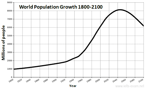
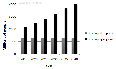
The graphs below provide information on global population figures and figures for urban populations in different world regions.
Summarise the information by selecting and reporting the main features, and make comparisons where relevant.
Summarise the information by selecting and reporting the main features, and make comparisons where relevant.
.

Source: http://en.wikipedia.org/wiki/World_population

The picture
below illustrates the data on World population figures and graphs for urban
populations in different places of the world. In both figure data is predicted
for certain years.
Overall
in the figure, Both line-graph and bar-graph had pinnacle in year 2040 with exceeding
8000 and 4000 Millions of people respectively. On the contrary, world
population had got its minimum population in year 1800 with 1000 millions of people.
Likewise in bar graph the lowest number of population was about 1400 millions.
Firstly ,
in line graph there was minimal increment of population till year 1880 after onwards
there was instant increment until 2040 after that, surprisingly it plummet in year
2100. Similarly in bar graph population in developed region in all year hovered in 1400,while in developing regions population of 2040 had outnumber
all years.
Secondly,
in line graph the minimum population that is in year 1800 is nearly about 1/8
part of the apex point in the line graph. Similarly in bar graph the base point
is nearly 1/3 of the acme point in year 2040, following same trend population
of people in year 2035 is more than twice than that of minimum population.
To sum
up, graphs show that the global
population increase will not occur evenly throughout the world, but will be
greater in some areas than others.
Band score 7.
No comments:
Post a Comment