Showing posts with label IELTS writing task1 samples. Show all posts

Saturday, August 15, 2015

IELTS writing task 1 -15

The table below presents the number of children ever born to women aged 40-44 years in Australia for each year the information was collected since 1981.

Summarise the information by selecting and reporting the main features, and make comparisons where relevant.
Write at least 150 words.


Number of children ever born, Women aged 40–44 years


Four or


One
Two
Three
more
None
child
children
children
children
year
%
%
%
%
%
2006
15.9
13.2
38.3
21.5
11.0
1996
12.8
11.3
38.2
24.6
13.1
1986
9.7
8.7
35.6
27.0
18.9
1981
8.5
7.6
29.0
27.4
27.6


Model answer 1
The table shows the number of children born to women aged 40–44 years in Australia in 1981, 1986, 1996 and 2001.

In 1981, women aged 40-44 years were only marginally more likely to have had two children than three children (29% vs 27.4%) or four or more children (27.6%). Similarly, by 1986, women of this age were considerably more likely to have given birth to two children than three children (35.6% vs 27%) or four or more children (18.9%).
 

In 1996 and 2006, the proportions of women aged 40-44 years who had given birth to two children were almost identical, though the proportions who had given birth to three children or to four or more children had decreased. In these more recent periods, women were more likely to have had two children than three or more children - a trend that was most marked in the most recent period (38.2% vs 24.6% in 1996; 38.3% vs 21.5% in 2006).

While two-child families now predominate, the number of women who had given birth to only one child increased progressively from 7.6% in 1981 to 13.2% in 2006.

In 1981, similar proportions of women aged in their early forties were childless or had given birth to only one child (8.5% and 7.6% respectively). By 2006, 15.9% of women were childless and 13.2% had given birth to only one child.

Overall, by age 40-44 years, the proportion of women who have had three or more children has fallen considerably since the 1980s, while the proportions who have had no children, or only one or two children has increased.
 Band score 7

Model answer 2

The figure represents the data of children ever born to women age ranging from 40-44 years in Australia for each year the information was amassed since 1981.

Overall in the figure, sector having two children outnumbered all  other data in all years with variable increment data from year 1981 to 2006.In whole figure 38.3% was the highest point representing the data of women having two children in year 2006.Whereas the lowest point was of 7.6% of women having one child in year 1981.

In all year, column of the two children had crossed a quarter, following same trend the field of three children were above a quarter in year 1981 and 1986 after onwards data were below 25%.Similarly all the other fields were below 25% except four or more children in year 27.6% having 27.6%.In year 1981 and 1986 data of three children and in year 1981 having four or more than for children have nearly the data of 27%.


To sum up, in all year women ranging 40-44 possess maximum amount of two children which had outnumbered all the data.

band score 7.5

IELTS writing task 1 -14

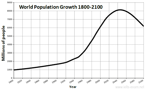
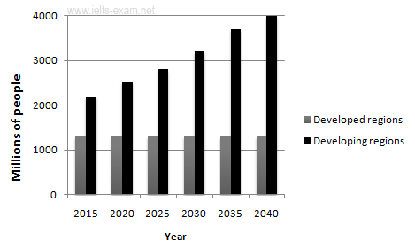
The graphs below provide information on global population figures and figures for urban populations in different world regions.

Summarise the information by selecting and reporting the main features, and make comparisons where relevant.
Write at least 150 words.


Model answer 1
The first graph shows the trend in world population growth between 1800 and 2100, while the second graph gives predicted urban population figures for the next 25 years.

The world population has experienced continuous growth since 1800. Between 1800 and 1950, the population grew slowly from just under 1 billion to 2.5 billion people. After that, the growth rate increased and currently the figure is around 6.5 billion. Projections show a continued increase in population in the near future, but a steady decline in the population growth rate. The global population is expected to peak at 8.2 billion by 2050, and then decline to around 6.2 billion by 2100.

The predictions also show that almost all urban population growth in the next 25 years will occur in cities of developing countries. In developed regions, on the other hand, the urban population is expected to remain unchanged at about 1.3 billion people over the next two decades.

The graphs show that the global population increase will not occur evenly throughout the world, but will be greater in some areas than others

Model answer 2

The figures illustrate the data on global population figures and figures for city populations in different world regions. In both graph population is measured in millions.

Firstly, in line graph the pinnacle point was in between 2040 to 2060 with above 8000 millions of people whereas the lowest point was in year 1800 with 1000 millions of people. From 1800 to 1920 there was the minimal growth after on wards there was the drastic increment nearly about 2045 then, surprisingly it soared down till year 2100.

Secondly, in the bar graph the apex point was in year 2040 with maximum number of population of 4000 millions in developing regions. However the lowest population was in developed regions nearly about 1200 millions of population in all year, since the data hovers in same number in the area. In developing regions the difference between all consecutive years are nearly equal.

To sum up, in both figure the maximum population was in 2040 whereas minimum was at the starting point.


Thursday, August 6, 2015

IELTS writing task 1-13

The graph below shows female unemployment rates in each country of the United Kingdom in 2013 and 2014.

Summarise the information by selecting and reporting the main features, and make comparisons where relevant.
Write at least 150 words.

Model answer 1
The bar chart shows the unemployment rates among women in the countries that make up the United Kingdom, both in 2013 and in 2014. There has generally been a small decrease in female unemployment rates from 2013 to 2014, except in Scotland.

In 2013, 5.6% of women in Northern Ireland were unemployed. The only country with a smaller percentage of women unemployed was Wales, with a rate of 5.4%. Both countries saw a decrease in the percentage of unemployed women in 2014. In Northern Ireland, the percentage fell to 4.6% and in Wales it fell to 5%.

England had the greatest percentage of unemployed women in 2013, with 6.8%. However, this decreased by 0.3% in 2014. Lastly, Scotland was the only country which had an increasing percentage of unemployed women. In 2013, it had 6.1% of women out of work. This increased to 6.7% in 2014, making it the country with the highest female unemployment rate of the four countries.
Band score 8

Model answer 2

The bar graph illustrates female unemployment rates in each country of the Great Britain in year 2013 and 2014.

Overall in the figure, the pinnacle point of unemployment was made by women from England with 6.8% in year 2013 whereas the lowest point was made by female in Northern Ireland with 4.6% in year 2014.

Firstly in the figure, it shows that among all countries England was at apex point in terms of unemployment with 6.8% and 6.5% in year 2013 and 2014 respectively. Secondly, following same trend in Wales and in Northern Ireland the unemployment female rate was steadily decreased with 0.4% and 1% respectively.

Likewise, among all countries Northern Ireland female rate was negative which represents development of country. On the contrary, Unemployment rate of women was increased in Scotland with 0.6% in year 2014.

To sum up, all three countries except Scotland moves in the way of development with certain percentage in a year.


Band score 7.5

IELTS writing task 1-12

The two pie charts below show the online shopping sales for retail sectors in Canada in 2005 and 2010.

Summarise the information by selecting and reporting the main features, and make comparisons where relevant.
Write at least 150 words.

Model answer 1
The two pie charts compare the percentages of online sales across different retail sectors in Canada in the years 2005 and 2010. For three of the sectors, it is evident that over this time frame there was significant change in their proportion of online transactions.

At 35% we can see that electronics and appliance sector accounted for the majority of online sales in 2005, but this percentage had dropped to 30% by 2010. During the same five-year period, as an increasing number of people chose to purchase food and beverage online, we can see that transactions went from just 22% to 32%, making it the retail sector with the largest overall proportion of the online market.

In 2005, the home furnishing industry boasted an impressive 25% of the total online sales in Canada. However, by 2010, the figure had fallen considerably to 15%. Interestingly, online sales of video games eventually overtook sales of home furnishings, although video games still represented only 23% of the market.

Model answer 2

The two figures elaborate the online shopping sales for retail sectors for retail field (Electronics and appliance, food and beverage, home furnishing and video Games) in Canada in year 2005 and 2010.

Firstly in year 2005 Canadian people spent about 35% in Electronic and appliance sector which had outnumbered all the sectors. Following same trend in increment home furnishing exactly a quarter. On the contrary, Food and Beverage and video games cover less than a quarter with exact percentage of 22% and 18% respectively.

Similarly, In year in 2010 Food and beverage had outnumbered all fields with 32%, following same trend Electronics and appliances occupied more than a quarter with 30%.Similarly, in year 2010 sales of video game was increased with 5% on the other hand, sales related to Home Furnishings slumped down with 10%. Likewise in case of Electronics and Appliance is soared 5% on the other hand, in sector of food it hiked up with exactly 10%.

To sum up, there is the certain fluctuation of data in both year and with the latest data it can be saied that Canadian make maximum online shopping in case of food.


Wednesday, August 5, 2015

IELTS writing task 1-11

The diagram below shows the production of electricity using a system called Ocean Thermal Energy Conversion (OTEC).

Write a report for a university lecturer describing the information below.
Write at least 150 words.


How Ocean Thermal Energy Conversion (OTEC) works


Model answer 1
Ocean thermal energy conversion (OTEC) is a system that converts heat energy into the electric power using the temperature difference between surface seawater, which can be up to 29 degrees Celsius, and deep seawater, which is only 5 degrees Celsius.
The main components of the system are an evacuated evaporation chamber, a turbine and a condensing chamber. The solar energy of the sun heats up the surface water and this warm water is introduced into the evacuated evaporation chamber, where it boils. As it boils, salt is deposited and water vapour is generated. This vapour then drives a turbine to generate electricity. After it powers the turbine, the water vapour enters the condensing chamber, which is cooled by the water from the depths of the ocean. The water vapour is condensed in this chamber, producing drinking water. Meanwhile, waste salt water is discharged into the ocean and the process can be repeated.
Band score 8.5


Model answer 2

The figure demonstrates the process of production of electricity using a system called Ocean Thermal Energy Conversion(OTEC)

Overall in the figure, in elaborates different uses of Natural sources (sea, sun) and other appliances as different kinds of chamber, turbine etc.

Firstly , the sea water is entered with two pipes one at the surface of sea having water temperature nearly about 29 degree whereas other was joined nearly about 600m downwards from sea level. As warm seawater is converted into water vapor by solar energy it is inserted towards evacuated evaporating chamber where salt and vapor is separated. As vapor is lighter in moves towards the pipe connected with turbine which generally moved inside the other chamber. Then, it flowed towards to condensing chamber.

Secondly from the dipper pipe cold water moves with higher pressure and circulates the condensing chamber mixing with salt water separated from Evacuated evaporation chamber and the vapor condensed in chamber creating pure drinking water. Then there is separation of drinking water and waste salt water.

In summary, the OTEC process shows method of filtrating pure water from sea water by using solar energy.


Band score 7.5

IELTS writing task 1-10

The chart below shows the number of travellers using three major airports in New York City between 1995 and 2000.

Summarise the information by selecting and reporting the main features, and make comparisons where relevant.
Write at least 150 words.

Model answer 1
The bar chart gives information about how many people visited New York City through three major airports, over a six-year period between 1995 and 2000.
Overall, it can be seen that over the period, there was a fluctuant trend in the number of passengers who travelled via John F. Kennedy airport, while the other two airports saw an upward trend. Another interesting point is that LaGuardia airport was the most popular at the end.
Looking at the detail, the number of travellers at John F. Kennedy airport started at 26m in 1995, and then increased remarkably to reach the highest point of 47m in 1997. In 1999, the figure dipped to 32m. At the last year, there was a slight growth to 44m. On the other hand, LaGuardia began at 35m in 1995, after that it rose remarkably for the next three years, at 46m. In 2000, LaGuardia hit the peak point at 68m travellers.
However, if we look at Newark airport, it started at the lowest point of 16m passengers in the first year. After this point, the trend increased significantly to 42m in 1998. In the last two years it remained stable at 42m travellers.
Band score 8.5


Model answer 2

The bar graph illustrates the data of visitors using three different airports in New York city between 1995 and 2000. The data is measured in terms of millions per year in the figure.

Overall in the figure, maximum amount of travelers used the LaGuardia airport in year 2000 and stayed at the apex point whereas there was a minimum use of Newark airport in year 1995 with about 13 millions of visitors and stayed in base point.

The use of LaGuardia airport by visitors was steady increasing year by year. Similarly there were certain fluctuations in the visitor’s number in case of John F. Kennedy airport. Likewise use of Newark aiport by visitors was in slow increment trend till 1998, after onwards the number of visitor hovered in 41 millions for three years. The highest data of LaGuardia is more than 6 times than that of lowest data made by Newyark airport.

To sum up, In Newyork city number of visitors is in increasing trend with maximum uses of three different airports.


Band score 7

IELTS writing task 1-9

 The line graph below shows the changes in the share price of Outokumpu companies in euros between January 2006 and December 2010.

Write at least 150 words.


.
Model answer 1
The graph shows the changes and a decline overall in the share price of Outokumpu in a five-year period from January 2006 through December 2010.
At the beginning of this period the share price was at EUR 13 per share. There were several fluctuations until late 2006 when there was a sudden increase from EUR 21 to EUR 31. This higher price did not last long, however, and it fell before rising strongly again in 2008. From mid-2008 there was a sharp downward trend through the end of the year when it fell to the lowest point in this period at just over EUR 7 per share. After that the share price recovered and, despite some fluctuations, continued to rise until it reached a peak of EUR 17 in early 2010. Until late 2010 the trend was downward again, ending the year at just over EUR 12.
Outokumpu made significant gains and losses during this period but overall lost around EUR 1 per share.
Band score 8

.
Model answer 2
The picture represents the fluctuations in the share price of Outokumpu companies in euros between the time intervals of 5 years from January 2006 to December 2010.

Overall in the figure, between 2006- 2007 the share price of the companies was at the pinnacle point about 31 euros per share. On the other hand, the lowest price of share was in year between 2008 and 2009 with the price about 7 euros.

In the starting year the market share price had drastic increment from about 12 euros to 31 euros between a year. Afterwards it gradually decreased reaching its value 21.on the same year it hiked to the second acme point with price of 30. In year between 2008 and 2009 rate of share soared to the lowest price. Then till 2010 there is fluctuation in price. Minimum rate is more than four times less than that of maximum.

In conclusion, Midyear of 2006-2007 and 2007-2008 Outokumpu companies share was sky rocketed whereas year 2008-2009 have lost value with maximum amount.

Band score 7.5

Monday, August 3, 2015

IELTS Writing Task 1-8

The table below shows the worldwide market share of the notebook computer market for manufacturers in the years 2006 and 2007.

Summarise the information by selecting and reporting the main features, and make comparisons where relevant.
Company
2006 % Market Share
2007 % Market Share
HP
31.4
34
Dell
16.6
20.2
Acer
11.6
10.7
Toshiba
6.2
7.3
Lenovo
6.6
6.2
Fujitsu-Siemens
4.8
2.3
Others
22.8
19.3
Total
100
100

Model answer 1
The table gives information on the market share of notebook computer manufacturers for two consecutive years, 2006 and 2007.
In both years, HP was clearly the market leader, selling 31.4% of all notebook computers in 2006, and slightly more (34%) in 2007. This is a greater market share than its two closest competitors, Dell and Acer, added together.
Dell increased its market share from 16.6% in 2006 to 20.2% in 2007. In contrast, Acer saw its share of the market decline slightly from 11.6% to 10.7%.
The other companies listed each had a much smaller share of the market. Toshiba’s share increased from 6.2% in 2006 to 7.3% in 2007, whereas Lenovo’s decreased slightly from 6.6% to 6.2%. Fujitsu-Siemens’ share more than halved from 2006 to 2007: from 4.8% of the market to only 2.3%.
Other notebook computer manufacturers accounted for 22.8% of the market in 2006 – more than all the companies mentioned except HP. However, in 2007 the other companies only made 19.3% of notebook computer sales – less than both HP and Dell.
 Band score 8

Answer 2
The graph elaborates the global share market of the notebook computer market for manufacture in the year 2006 and 2007.

Overall in both years, HP Company’s market share was at the pinnacle point in year 2006 and 2007 with 31.4% and 34% respectively. On the contrary Fujitsu-Siemens was at the lowest point with 4.8% and 2.3%in 2006 and 2007 respectively. Similarly, Lenovo’s market point hovers nearly in same amount that is 6.6% and 6.2%.

Firstly, From year 2006 to 2007 the Hp Company’s  slightly increased its market share with the difference of 2.6%.Following same trend Dell the second highest share holder  and  Toshiba also hiked up in 2007.On the other hand, all other company(Acer Lenovo, Fujitsu-Siemens and others had plummet down with certain percentage.

Secondly, the Company which is located in apex point is more than six times than that of the base one. Likewise in year 2007 the lowest amount of share holder Fujitsu-Siemens’s Market share is about 15 times less than that of HP

To sum up, all three Company HP, Dell and Toshiba had accumulated certain share level in a year whereas other had slumped down some share market in 2007 in comparison to 2006.


Band score 7.5

IELTS Writing Task 1-7

The line graph below shows the percentage of tourists to England who visited four different attractions in Brighton.

Summarise the information by selecting and reporting the main features, and make comparisons where relevant.

Model answer 1
The line graph shows the percentage of tourists to England who visited certain Brighton attractions between 1980 and 2010. We can see that in 1980 and in 2010 the favourite attractions were the pavilion and the festival. In 1980 the least popular attraction was the pier but in 2010 this changed and the art gallery was the least popular.
During the 1980s and 1990s there was a sharp increase in visitors to the pavilion from 28% to 48% and then the percentage gradually went down to 31% in 2010. The trend for the art gallery was similar to the pavilion. Visitors increased rapidly from 22% to 37% from 1980 to 1985 then gradually decreased to less than 10% over the next twenty-five years. The number of tourists who visited the Brighton Festival fluctuated slightly but in general remained steady at about 25%. Visitors to the pier also fluctuated from 1980 to 2000 then rose significantly from 12% to 22% between 2000 and 2010.
Band score 8.5

Model answer 2
The picture depicts the percentage of visitors to Britain who travelled for four different variety of attractions (Art Gallery, Pavilion, Pier and Festival) in Brighton from year 1980 to 2010.
Overall in the figure the highest point was in 1995 made by visitor in order to view pavilion with nearly49% whereas the minimum amount of tourist visit in year 2010 for the purpose of experiencing Art with below 10%.Likewise the plateau had formed from year 2000 to 2010 with28% of visitors.
For engaging in Art gallery there was drastic increment from 1980 to 1985 then it  slumped to 20% after it reached below 10% in 2010.Likewise In pavilion sector the number hiked till pinnacle after onwards it plummet to 31%.. in context of pier there was a sparse fluctuation  whereas for Festival purpose the visitors number hovers between 20% to 30%.
In summary, among all choices Visitor visited for the purpose of festival in england in between 30 years.

Band score 7.5

IELTS writing Task 1 - 6

The graph below shows the number of books read by men and women at Burnaby Public Library from 2011 to 2014.

Summarise the information by selecting and reporting the main features, and make comparisons where relevant.

Model answer 1
The graph gives information about Burnaby Public Library between 2011 and 2014. It shows how many library books people read over this four-year period.
As can be seen from the graph, there were different trends for men and women. The number of books read by men increased steadily between 2011 and 2012, from about 3000 to 4000. After that, the number rose dramatically to 14000 books in 2014. This was the highest figure in the period.
Women started off reading more books than men, but their numbers followed a different pattern. Between 2011 and 2012, there was an increase of 3000 from 5000 books to 8000 books, and then a gradual rise to 10000 books in 2013. However, in 2014, their numbers fell back to 8000 again.
Overall, there was a strong upward trend in the number of books read by men. Although women read more books than men in 2011, their reading fell to below the level of men in 2014.
(162 words)  Band score 8

Model answer 2
The figure illustrates the information about the number of books read by both gender (men and  women) at Burnaby Public Library from year  2011 to 2014.
Overall in the figure, the peak point was in year 2014 with 14000 above by men where as the lowest point is in year 2011 with more than 2000 female readers. Likewise both line formed a intersection point in year 2013 with about 10000 readers.
The line graph which was formed by men it had minimal increment form 2011 to 2012, then from 2012 to 2014 there was a drastic increment in books number .Similarly, in 2011 women read book nearly about 4200 books which inclined with same flow till the intersection point in 2013.Suprisingly, the number of books read by women drastically slumped down in 2014.
In summary, in Burnaby Public Library the women readers outnumbered till 2013 from 2011 whereas male reader outnumbered just in 2013 to2014.
Band score 7


IELTS writing task 1 -5

The diagrams below show the changes that have taken place at Queen Mary Hospital since its construction in 1960.

Summarise the information by selecting and reporting the main features, and make comparisons where relevant.

Model answer
The diagrams show Queen Mary Hospital at three different stages in its development: 1960, 1980 and 2000.
In 1960, the hospital was built close to a main road and next to a shopping centre. A large area behind the hospital was turned into a car park, while the area behind the shopping centre was farmland.
By 1980, the shopping centre had been demolished in order to make way for two additional hospital building which became a pharmacy and a cancer centre. Furthermore, the hospital gained the farmland and converted it into a nursing school.
In 2000, the main hospital building remained unchanged but the cancer centre was extended to cover the entire nursing school. As a result of this, the original car park was divided into two so that it provided a smaller car park and a small nursing school.
During this period, the hospital has increased in size and, in addition to a new nursing school, a cancer centre has been created and extended. Hence the capacity of the car park has been reduced by a half.
(178 words)


Saturday, August 1, 2015

IELTS writing task 1 -4

The pie charts below show the average household expenditures in Japan and Malaysia in the year 2010.

Summarise the information by selecting and reporting the main features, and make comparisons where relevant.


The graphs below elaborate the median data of household expenses in two different Asian countries (Japan and Malaysia) in the year 2010. Household Expenditure in figure is housing transport food healthcare and other miscellaneous goods.

Firstly, In Japan maximum amount of expenditure was in miscellaneous goods with more than a quarter. Likewise people expended around a quarter with 24%. On the other hand there is just a percent different between housing and transportation with 21% and 20% respectively. Likewise in case of health sector it covers small fractions with 6%.

Secondly, Malaysian spent more than a quarter about 34% in housing field and following same trend they spent 27% and 26% in food and other goods and services respectively. Whereas both transportation and healthcare covered less than a quarter of chart. Both countries give less focus to health sector and more priority to other fields. All date in both countries are nearly similar but Japanese spent exactly double in transportation and health sector than that of Malaysian


Overall, both Asian countries made an equivalent expenditure in sector of Housing, Miscellaneous goods ,and food whereas incase of health and transportation there is vast difference.

Band score 7


IELTS writing task 1 -3

The graphs below provide information on global population figures and figures for urban populations in different world regions.

Summarise the information by selecting and reporting the main features, and make comparisons where relevant.
.
ielts writing task 1 preparation
Source: http://en.wikipedia.org/wiki/World_population

ielts writing task 1 preparation

The picture below illustrates the data on World population figures and graphs for urban populations in different places of the world. In both figure data is predicted for certain years.

Overall in the figure, Both line-graph and bar-graph had pinnacle in year 2040 with exceeding 8000 and 4000 Millions of people respectively. On the contrary, world population had got its minimum population in year 1800 with 1000 millions of people. Likewise in bar graph the lowest number of population was about 1400 millions.

Firstly , in line graph there was minimal increment of population till year 1880 after onwards there was instant increment until 2040 after that, surprisingly it plummet   in year 2100. Similarly in bar graph population in developed region in all year  hovered in 1400,while in  developing regions population of 2040 had outnumber all years.

Secondly, in line graph the minimum population that is in year 1800 is nearly about 1/8 part of the apex point in the line graph. Similarly in bar graph the base point is nearly 1/3 of the acme point in year 2040, following same trend population of people in year 2035 is more than twice than that of minimum population.

To sum up, graphs show that the global population increase will not occur evenly throughout the world, but will be greater in some areas than others.

Band score 7.